
My overall view of the economy last quarter was one of cautious optimism. I remain generally optimistic. To summarize where we currently stand:
- The economy is basically at full employment, based on the levels of GDP and the unemployment rate.
- Inflation has been consistently in the news but it appears to be nearing its peak.
- Monetary policy has cooled off substantially in the past few months with the likelihood that we will see a rate hike in the next meeting or two of the Federal Open Market Committee (FOMC).
- Labor force participation rates of the prime age labor force are close to their pre-pandemic levels.
- And retail sales remain strong, and the worst of the omicron wave appears to have passed.
Concerns remain about supply chain issues, potential additional inflation, perceived labor shortages, potentially huge conflicts with China and Russia, and continuing uncertainties with COVID. Those concerns, however, should not obscure the fact that the economy is near full employment and growing at a sustainable pace.
Looking at GDP, the broadest commonly used measure of economic activity, at the end of 2021 actual real GDP was within $100 billion of potential GDP. That should be taken as excellent news. We are at full employment and have not pushed beyond and into territory typically associated with inflationary pressures from excess demand. In terms of the components of GDP, consumption, historically comprising about 70 percent of GDP, is on the same growth path as it was pre-pandemic and is about 70 percent of GDP even with less than expected fourth quarter growth, likely due to pandemic-related concerns due to omicron. Real private gross investment, the second largest component of GDP, had slow initial growth with the pandemic but in the second half of 2021 surged dramatically. The current spurt in investment appears poised to offset the reduction in investment during the heart of the pandemic-related recession. That is good news in both the short-run and the long-run. In the short-run we see a boost in GDP and in the long-run we should see an increase in our productive capacity. The only negative from a GDP perspective is that net exports have fallen substantially, about $400 billion from their pre-pandemic level. There is a sliver of good news even there, however. That growing trade deficit appears largely due to the U.S. economy growing more rapidly than most other economies. Last quarter I mentioned this weakness and indicated that for the U.S. economy to quickly move back to full employment, investment would have to pick up the slack at least in the short-run. That is exactly what happened in the second half of 2021.
Turning to labor markets, they have also been consistently in the news, and not for good reasons. Last quarter I focused on labor force participation rates (LFPR). The conventional perspective is that LFPRs fell at the outset of the pandemic and have not recovered. The data indicates a more nuanced perspective. The LFPR of prime-age workers, those 25-54 did fall but has now virtually completely recovered to its pre-pandemic level. The LFPR of those over 54, however, also fell and that rate has not risen. At this point, individuals over 54 who have dropped out of the labor force are likely best considered as permanently retired.
The other feature of labor markets that has commanded attention is the high rate of voluntary job separations, what has been called The Great Resignation. Chart 1 presents job vacancies, quits, and layoffs over both the Great Recession and the current pandemic period. The most obvious item in the graph is that layoffs rose dramatically in early 2020 at the outset of the pandemic. The highest monthly increase in layoffs during the Great Recession was “only” about 700,000 while total layoffs during that period increased by almost 3 million over the baseline level of layoffs. At the outset of the pandemic, layoffs increased by about 18 million over the baseline in just a two-month period. Since then, layoffs have been well below their historical average. The recent drop in layoffs is substantial but has been largely unreported in the wake of other more dramatic labor market events. What has been reported is The Great Resignation, a substantial increase in the number of job quits. But the reporting on the number of quits appears overblown given the underlying data. Chart 1 indicates a growing number of quits since the end of the Great Recession. During 2019, the average number of monthly quits was about 3.5 million. That number dropped dramatically during the worst of the pandemic and has risen since then, averaging almost 4.3 million over the past six months. Does this reflect a Great Resignation or does it reflect the continuing upward trend in resignations combined with resignations of some who would have resigned earlier in 2020-21 but postponed it until there was less risk in terms of finding employment? To date, the data does not clearly answer that question. What the data does indicate is that quits are up somewhat, perhaps rebounding from their prior low levels, while layoffs are down somewhat, perhaps because there were so many recent layoffs that relatively few are required today.
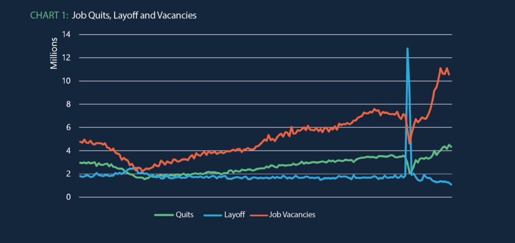
The last item in Chart 1 is the number of job vacancies. Again, it is important to put recent events in context. Since the end of the Great Recession, the number of job vacancies has steadily risen. Given the near constant level of layoffs – with a slight and almost imperceptible decrease – coupled with a steady increase in quits, we should expect to find an increase in job vacancies. The pandemic also scrambled the data there with a large drop in vacancies as many sectors of the economy shut down. With the gradual increase in vacancies pre-pandemic, it would be reasonable to expect job vacancies to be about 8 million. In fact, they are averaging about 10.5 million. The numbers in Chart 1 do not explain the gap. However, the apparently permanent drop in the labor force participation rate of those 55 and older suggests a decline in the labor force of over 2 million workers, roughly the gap between actual job vacancies and those expected based on the prior job vacancy trend.
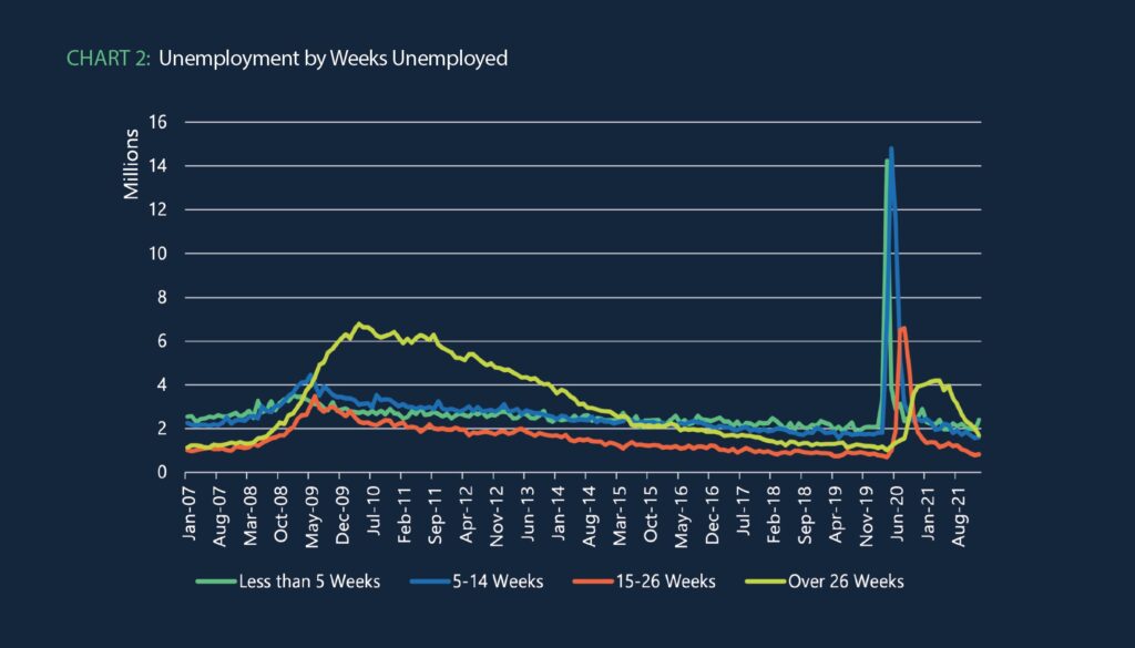
There remains one last piece of the labor market puzzle to address, the length of time individuals are unemployed. Chart 2 presents the number of individuals unemployed by the length of time unemployed, less than 5 weeks, 5 to 14 weeks, 15 to 26 weeks, and greater than 26 weeks. The comparison of the Great Recession and the current pandemic is informative. With the Great Recession there was a substantial increase in unemployment at all lengths, but the most dramatic increase was at the long end with many workers unemployed for over 26 weeks. In contrast, with the pandemic there was a huge initial spike first in the less-than-five-week bucket, moving shortly to the 5-14 week bucket, and then a few transitioned to the longer buckets. As lockdowns were gradually ended, there was no huge surge in long-term unemployment. After the Great Recession, the number of long term unemployed did not return to a near-normal level for five years. In contrast, with the current recession the number of long-term unemployed has already returned to a near-normal level. The bottom line from Chart 2 is that while the pandemic inflicted a terrible short-term shock on the economy, the recovery from that shock has been remarkably quick, and the labor market now appears to be in what should label “surprisingly normal circumstances.”
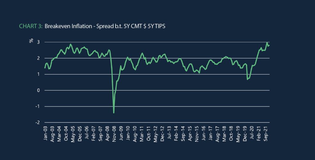
The last major macro variable to briefly consider is inflation. Headline news has repeatedly noted large price increases in different areas. Some prices have risen substantially and the overall inflation rate is higher than we have seen in many years. Nevertheless, the U.S. is not in a position of excess demand, and the rest of the world has substantial excess supply. The Federal Reserve is well aware of the potential danger of inflation. And supply shocks should have only a temporary impact on inflation. Thus, the best measure of where inflation is likely going over the next few years remains the spread between the 5 year Treasury rate and the 5-year TIPS (Treasury Inflation Protected Security) rate. Chart 3 presents that rate, basically the expected inflation rate. Is inflation possible? Absolutely. We see an increase in the expected inflation rate up to almost three percent. But those with money at risk are fundamentally betting that there will be no major inflationary pressures in the next five years.
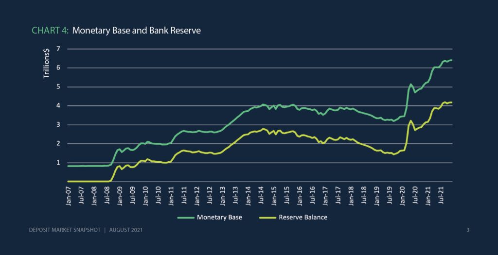
Looking at GDP, labor markets and inflation first provides a strong introduction to monetary policy and likely Federal Reserve actions. These three areas will be the most critical in terms of determining Fed actions. Chart 4 presents growth in the monetary base and in bank reserves. As noted in my last two quarterly market summaries, it has looked like the Fed has been slowing the rapid growth in the monetary base (MB). The trend is even more apparent now and is further supported by Fed statements indicating that a rate increase could soon be on tap. After the Great Recession MB was gradually reduced for years as the Fed attempted to unwind its bond holdings built up through successive waves of Quantitative Easing (QE). It is unlikely that we will see a similar period of unwinding before the Fed embarks on a period of rate increases.
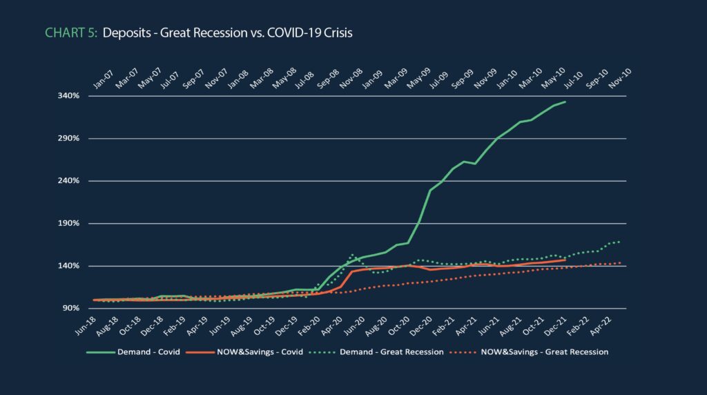
Finally, in terms of implications for deposits, Chart 5 updates our graph comparing the financial crisis with the COVID-19 crisis in terms of rapidly growing deposits. As noted previously, the Great Recession saw a dramatic increase in both demand deposits and savings deposits (now other checkable deposits), but the pandemic has seen even greater growth. There was much debate after the worst of the financial crisis was over concerning when or if those additional deposits were going to be withdrawn. My argument then was that most of them were not likely to be withdrawn. They were simply not “surge” balances. They likely reflected a long-term increase in the deposit base predicated on an increase in depositor uncertainty that generated additional deposits for liquidity reasons. For the financial system in general, that was the case. Should we expect the same with this further growth in deposits? If you think those deposits represent further uncertainty concerns, then bet on those deposits remaining in the financial system. If those deposits represent pent-up savings, then bet on them eroding over the next few years. Me? I am going with uncertainty.
About MountainView Risk & Analytics
For over two decades, MountainView Risk & Analytics, A SitusAMC company, has helped clients accurately forecast outcomes and make balance-sheet decisions through an integrated methodology and advanced statistical modeling that incorporates a multi-layered, institution-specific analysis. We assist clients in developing credit risk, model risk and enterprise risk strategies and infrastructures to achieve optimal profits, as well as assessing and quantifying the various risks embedded within the organization. Our team collaborates with clients and provides insights and best practices from engagements across the country, bringing this knowledge to bear on every assignment to assist clients in their business needs. If you would like to learn more about working with MVRA please submit a request to connect today!